Avoiding Confirmation Boxes
One thing I try to avoid in interface design is unnecessary user interaction - Basically, asking the user for feedback when it isn't needed. The area that probably bothers me the most are confirmation boxes - Especially those that block the entire application until you've clicked 'OK'?
I'm not really sure why you see them so often in applications since I'm pretty sure that users and developers alike probably get tired of seeing them. Not only that, studies have shown that they are mostly ineffective, normally only earning a cursory glance before being dismissed.
So what can you do instead?
Don't Confirm Success, Notify On Failure
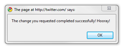
Probably the easiest and quickest improvement to an application is to stop confirming when your application worked. How many times have you seen this pointless little window pop up?
Uh, yeah...
For the most part, a user should be able to assume that their "request completed successfully." -- Otherwise, why the heck did they buy your software to begin with?
Instead, pop up a modal dialog box if something goes wrong and their request didn't work. This is a much better time to interfere with user work flow.
Allow Permanent Dismissal
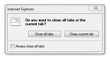
New users of an application don't mind confirmation boxes as much since they are still poking around and trying to figure out what everything does. But after the 10th or 15th time the 'your request has been completed!' message is starting to wear on them.
Sure, it was helpful at first but now that they know the expected behavior, the additional confirmation is an annoying extra click.
Ah, now that is better. I'm confident using this part of the program - stop bugging me!
Even Better - Don't Confirm, Make It Easy To Undo
Remember the computer before the undo button? It was painful and frustrating, but then one day like magic we could fix our silly fat-finger mistakes - Genius!

What about the Internet before the undo button? Oh... wait. The 'undo' button is actually still pretty uncommon in web applications. Of course, web applications aren't the only area that this applies - but it is still possible to make it happen. GMail is a great example of how this applies to any application - including the web.
The message explains what happened and gives immediate actions for the two most probably user responses - "What the heck did I just do?" and "Oh snap, I didn't mean to delete that!".
Use Visual Indicators As Confirmation
Visual indicators work well as additional confirmations. If you make it clear enough what a user is about to do then normally you can avoid a confirmation box.

Red highlights, short and clear sentences, explanation of the final result - All of these items act as an additional confirmation for the user to understand the result of their action. To take it a step further, the text on the button OK would be even clearer if it said Delete (see how easy this is!)
It doesn't take much to reduce, and in many case eliminate, the dialog boxes we pop up in our applications. You'll be happier, your users will be happier -- Heck, I'll even be happier even if I never use your application.
What are ways you can use to limit the number of dialog boxes you use in your applications?
June 14, 2010
Avoiding Confirmation Boxes
Post titled "Avoiding Confirmation Boxes"
 hugoware.net is licensed under a