Lost In Space (404)
Recently, I put the finishing touches on the 404 page for my site. If you haven't seen it yet, you can check out the complete 404 page here
I normally make the joke that missing pages have been sucked away into another dimension - and that is exactly what I wanted to convey with this page.
It's worth mentioning that everything on this page is CSS - no JavaScript. So, if you aren't using an advanced browser then you're going to see stationary images instead of an animation.
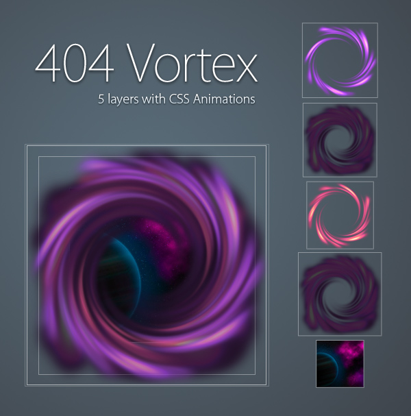
The Vortexes
In all honesty, this was the easy part. Stacking multiple rotating layers on top of each other, each with a slightly different level of opacity and rotation rate.
For the most part, each of the vortexes had fairly similar rules - Setting the image, z-index, opacity, and rate of rotation.
.vortex-1 {
  background : url(vortex-1.png);
  z-index : 3;
  -webkit-animation: spin 4s infinite linear;
}

.vortex-2 {
  background : url(vortex-2.png);
  z-index : 4;
  opacity : .8;
  -webkit-animation:spin 11s infinite linear;
}

.vortex-3 {
  background : url(vortex-3.png);
  z-index : 5;
  opacity : .6;
  -webkit-animation:spin 20s infinite linear;
}

.vortex-4 {
  background : url(vortex-2.png);
  z-index : 2;
  opacity : 1;
  -webkit-transform : scale(1.5);
  -webkit-animation:spin 30s infinite linear;
}

@-webkit-keyframes spin {
  0% { -webkit-transform:rotate(0deg); }
  100% { -webkit-transform:rotate(360deg); }
}
PNG files tend to be very large, so in order to reduce the size of each vortex, I converted each image to an 8-bit alpha transparency PNG (yes, they do exist!)
Normally, these kinds of PNGs look a bit uglier than their unmodified counterparts, but each of the opacity rules and animation rates working together create a blending effect that hides any quality loss that comes with the conversion.
Space Background
At the very bottom of the vortex stack sat the space background, which actually comes from the ProjectRU page.
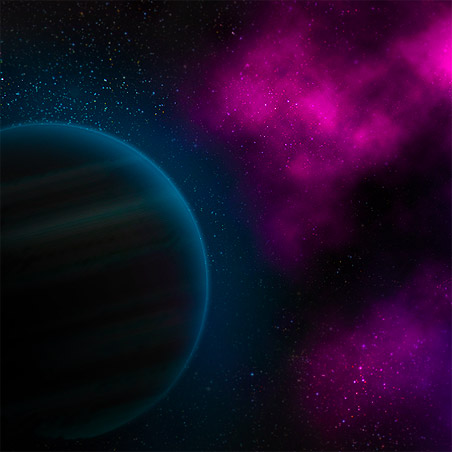
In this instance, I swapped the direction of the rotation in the attempt to create a universe that was truly out of control.
.background {
  background : url(background.jpg);
  z-index : 1;
  -webkit-animation: reverse-spin 90s infinite linear;
}

@-webkit-keyframes reverse-spin {
  0% { -webkit-transform:rotate(0deg); }
  100% { -webkit-transform:rotate(-360deg); }
}
Again, fairly easy to accomplish by simply switching the rotation to negative (counter clockwise).
Oh, But Wait... There's More!
Now, this is the point where things got difficult.
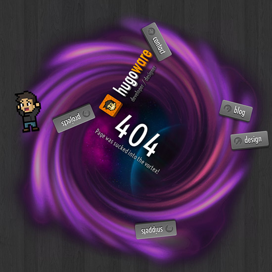
I really wanted the site's interface to get sucked in as well but this proved to be considerably more difficult.
First off, animations are tricky -- especially if you try to change the same property (for example, transform) with multiple rules. This ended up with only the last rule being applied.
Second, large sweeping movements tend to send UI elements off the page, which in turn causes the scroll bars to jump around. It doesn't ruin the effect, but it is a bit annoying. In fact, even now, FireFox still has this problem.
Pulling To The Center
Initially, I tried to cause the UI elements to rotate around the center of the vortex by simply adjusting the positioning and rotation of each element from where they currently sat. This ended up creating very jerky transitions as well as being impossibly difficult to align each button.
My second pass involved moving the buttons to the center and then transforming them back to their original position. This made it so they had a constant center and made for smoother animations.
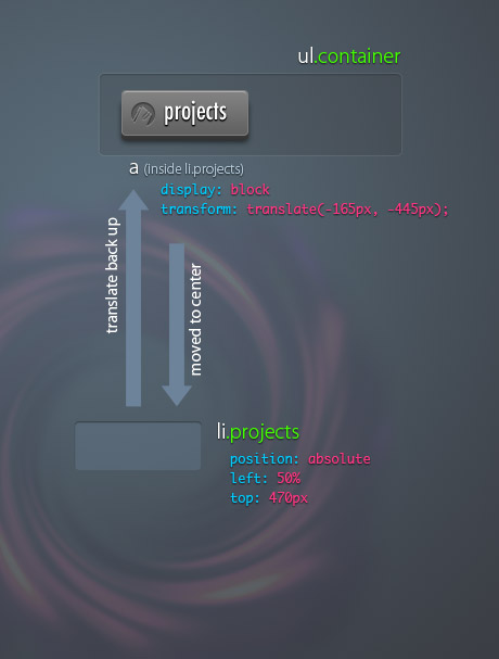
The pulling animation would decrease the translate amount which gave the appearance of the element being drawn back into the center. Of course, to create the effect that it was caught up in the vortex, the values were only reduced and not set to zero. This makes sure that they hover around the outside of the vortex.
The rotation effect was created the exact same way as the vortexes, but because the center was constant, it made it much easier to rotate around the center.
I'd like to say that I used my mathematical powers to calculate the exact distances to transform each element -- but in all honesty, I just nudged elements around and refreshed the page until everything looked correct.
Staying Within Bounds
This one seemed easy at first, but as it turns out I'm not quite finished just yet.
Absolutely positioned elements can cause scroll bars to appear if they move off the right or bottom side of the page. In this instance, as buttons would rotate, the invisible areas of the element would move off the page and cause the scroll bars to fly about.
In order to keep everything contained, I created an absolutely positioned container that would hide anything that overflowed out side the edges.
#nav {
  position: absolute;
  top : 0;
  left : 0;
  height : 1100px;
  width : 100%;
  overflow: hidden;
}
This created a container large enough that elements could float about freely, but kept everything contained within the page. Or, so I thought...
Unforuntately, it turns out FireFox isn't behaving correctly just yet. I'll update this blog post as I come up with a solution.
Conclusion
I'm pretty happy with the way this page turned out. Modern browsers get a visual treat, while others (IE) get a nice looking image of a vortex.
For now, I'm off to my next project -- JS1K!
February 16, 2012
Lost In Space (404)
Creating the Hugoware.net 404 page
 hugoware.net is licensed under a