Writing Better Error Messages
I'm pretty picky about user interface with a lot of the projects I work on ranging from the user experience to the design and layout. Ever since I read Steve Krug's, Don't Make Me Think, I find myself spending a lot of time reading over the same content again and again trying to simplify them to their shortest possible length.
One section that has always been a focal point for me has been error messages or really any dialog that requires user interaction. However, I'm not just talking about the cryptic, developer designed error messages like 'IOError Detected!' or 'Generic GDI+ Error' (I especially hate that error).
No, the error messages I'm talking about are messages that don't really help the user -- or error messages that help the user, but too late into the message.
The Anatomy Of An Error Message
Not all situations are the same but I try to write all of my error messages in the following order.
- What happened in a short sentence.
- Give the user options and solutions
- Explain in slightly more detail what happened but only if the problem may happen again or it helps them understand how to avoid the problem.
What Happened? Few Words Should Say It All -- Or Don't Bother!
I try to stay brief with everything... well, except blog posts, of course. In my latest project I tried to keep everything to a sentence or two. I've had a lot of feedback that people like how short and to the point everything is.
Your error message should be the same - short and to the point. Don't waste a lot of time explaining why it broke or telling them what happened in the background that caused the failure.
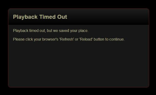
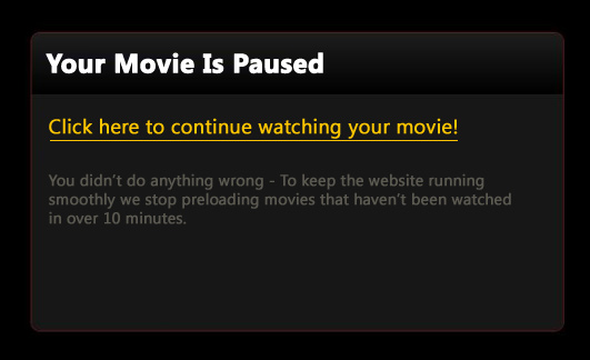
In some cases you don't even need to present the problem as an error message especially if the resolution is simple. The Netflix message is a good example of this. The message feels a lot like an error - but should it? Or should it be presented that this message is the natural result of leaving the page idle?
User Options - Empower The User Quickly
Giving the user the control to fix the problem right away should immediately follow the title of the error - not an explanation of the problem. Include only as many options are really relevant.
I'd even go as far to say that even Yes and No buttons should have a description as well. Explain what the yes and no buttons will do -- even if it seems obvious. A button that reads "Yes; Save my document to the server" is much clearer than simply a button that says "Yes" or "OK".
The Netflix error says to reload the page -- manually. Why? Chances are they already have a mouse nearby -- why not simply say Click Here To Continue Your Movie! and handle reloading their page when they press the button?
They do offer a suggestion but they don't offer to do it for you, which I think would improve this box a little more.
Explain The Problem: But Only If It Matters
I'm sure this part would be a point of contention to many people. Often we feel like we need to tell the user what is wrong but also why there was a problem. Clearly, each situation is different, but more often than not I think that the 'why' is irrelevant. Here are a few times I think explaining why is important.
- The user might make the same mistake again (ex. invalid e-mail addresses)
- The problem might make a user think your service is broken and you need to explain that it is either normal procedure or a problem from somewhere else.
- To answer why a response is required (ex. input form that wants information a user might not be comfortable in providing)
More or less, if the reason why doesn't affect the user then you don't need to share it. If your function SaveUserData() crashes and returns an 'Unable to save to /Data/Profiles/Users.txt' error then don't tell your user. Simply saying 'We're sorry - We had a problem saving your information' is more than enough information to explain why they need to do the same step twice.
My Version
Remember, I like to nitpick this kind of thing. I realize that error messages in my own programs could be improved as well. That said, here is a sample that I think would work better for visitors.
With this message, we are to the point faster and offer a solution to the problem immediately. I also dimmed the error message some and highlighted the actions that could be taken so the user would be drawn to it quickly. I'm sure this message could be improved upon even more but this seems like a good start.
November 8, 2009
Writing Better Error Messages
Ideas on how to write short, clear error messages.
 hugoware.net is licensed under a